Excess Deaths versus Percent Vaccinated
A comparison of the timing of excess deaths and population vaccination percentages by age
The other day, LexNotRex on GETTR made the following comment on one of my posts.
I had been thinking about that as well and it was on my list of things to do.
So here it goes.
Data
The data sets I use are both from the CDC. Every chart in this post can be created using the following two data sets.
The excess mortality charts to which LexNotRex is referring are the ones created by Ed Dowd and the first data set used in this analysis is the same set I used to reproduce the Dowd charts in this post.
AH Excess Deaths by Sex, Age, and Race and Hispanic Origin.
The second is the vaccination data found here:
COVID-19 Vaccination and Case Trends by Age Group, United States
A couple of notes on the data:
The Excess Death data set is from February 23, which means it was created before the CDC remapped COVID deaths to non-COVID deaths on March 15. See here. That’s Ok for now since we are more concerned with total excess deaths rather than looking at them by COVID and Non-COVID.
The vaccination data breaks the data down by different age categories than the original Dowd charts so we will have to create of version of the excess death percentage chart that aligns with the vaccination data. The first age group we are going to look at is 40-49.
Graphing the Results
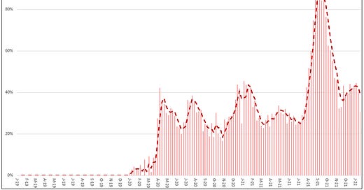
Let’s get grounded. I will start with a version of the excess death percentage chart for ages 40-49. This can be calculated straight from the first data set listed above.
So, the question is, as more and more of those age 40-49 got vaccinated, what happened to the excess death percentage? We can get a sense of that if we superimpose the percent vaccinated on this chart across time like LexNotRex suggested.
Like this.
The blue line shows the percent of the population who have completed vaccination for ages 40-49. Note, the percentages for vaccination are shown on the right vertical axis while the excess death percentage is shown on the left vertical axis.
One word of caution. The chart is useful to see how the values are changing over time in relation to one another. However, you should not compare values. In other words, the left axis represents excess percent deaths while the right access represents percent of population so, for example, 60% on the left means something different than 60% on the right.
For context, here are total deaths for expected, non-COVID excess deaths and COVID, which all add to actual deaths so you can appreciate the magnitude of excess deaths relative to all deaths (recognizing that the COVID deaths are overstated because this data does not reflect the CDC change from March 15).
At the bottom of this post, I will include the charts for the other age groups but for now, let’s dive into this a bit.
Adjusting out excess deaths unrelated to vaccines
Recognizing that correlation is not causation, right off the bat, the chart comparing excess deaths to percent vaccinated is pretty revealing. It shows the increase in percent vaccinated followed soon after by a spike in excess deaths.
But what about the excess deaths before the vaccines were rolled out that are unrelated to COVID? I covered that for ages 25-44 in this post and the drivers are generally the same for 40-49 including, drug and alcohol, cardiovascular issues, car accidents, etc.
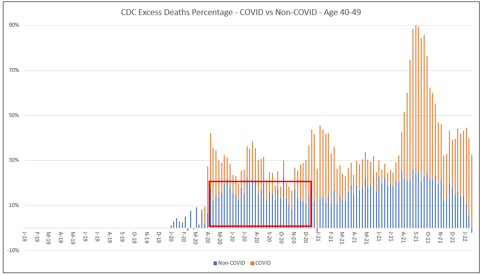
Here is the excess death chart for ages 40-49 for COVID and non-COVID.
I have put a box around the deaths we would want to remove from 2021 because they continued on from 2020 and are unrelated to both vaccines and COVID (at least, that is the assumption here).
If we do a quick adjustment to take them out, the chart looks like this. The point being that once you focus only on the deaths that could be from the vaccine, the increase in deaths in August through December is much more pronounced.
One more comment on this. You may have noticed that I left in some excess deaths in 2020. These are the COVID deaths. The reason we didn’t adjust 2021 for those excess deaths like we did the non-COVID is because one of the questions we will be asking is whether the spike in deaths in 2021 is due to COVID or due to the vaccines, which means we can’t assume COVID deaths are the same level in each year like we did for non-COVID.
Ok, that was a bit complicated but let’s just move on and focus on the chart directly above. Setting aside some unknown force that accelerated deaths in the latter half of 2021, in my mind, there are three possible explanations for the large spike in excess deaths occurring between August and December 2021 we see in some age groups.
I discuss those next.
Three Possible Explanations
It’s COVID, unrelated to vaccines
Recall the COVID/Non-COVID chart for 40-49 from above. You will see that much of the excess in August through December 2021 is defined by CDC as COVID (again, before their March 15 adjustment which will bring that down some but probably won’t change the story much for this age group).
So, if true, the best you could say is that your vaccine stinks as the Delta variant became dominant. Note, however, this would require Delta to be significantly worse than the variants that were floating around in 2020, especially given the vaccine was widespread by then yet COVID deaths still spiked.
There is a problem with that, though. Look at the COVID/Non-COVID for 75+. For this explanation to work, it means Delta had to be worse for 40-49 but not for 75+.
Or maybe the 75+ were better vaccinated? Nope. Not that much better.
The argument for this explanation is that COVID deaths did drop soon after the vaccine was rolled out, so they were working as seen in both the 40-49 and the 75+ and that the reason 75+ didn’t spike as much during Delta was that many of the 75+ had already died. Having said that, I think the increase in deaths for the 40-49 is too great for this to be the sole explanation.
So, if it wasn’t just that COVID was significantly worse in the latter part of 2021, what was it?
The spike in deaths was due to the vaccine but the deaths were “with COVID” rather than “from COVID” and the CDC just called them COVID.
There actually could be something to that, especially given the recent recategorization of COVID deaths to non-COVID on March 15. Who knows, maybe there are more. I am still working through that change in my underlying data.
The problem I have with this explanation accounting for all the spike is that it is just too much mis-categorization to account for all of it.
Having said that, there is work that can be done here looking at changes in the levels of underlying causes, like heart attacks, that could point to the vaccines. So, more work to do here. Digging into the details of COVID deaths is on my list.
The deaths are COVID, but the cases resulted in more deaths due to Vaccine-Associated Enhanced Disease and Antibody Dependent Enhancement from the vaccines.
In this explanation, the COVID death spike in August and December is real but the COVID cases were made worse and more often led to death due to the vaccines harming the immune system and/or through antibody dependent enhancement as the vaccines waned.
The reason we don’t see the same spike in 75+ is, just like the vaccine injuries like myocarditis, this dynamic had a deeper impact on younger ages.
There is also work to do here by looking more closely at the COVID deaths and how associated causes changed over time.
Summary
In the end, I believe it is likely a combination of all three explanations. COVID cases probably did increase with Delta but also due to VAED and ADE, while at the same time, some of those deaths coded as COVID were from vaccine injuries.
There is more work to tease this all out. What is undeniable, though, is that deaths spiked soon after the vaccinations rolled out.
Finally, here are the charts for the remaining ages (these are the raw data and not adjusted to remove 2020 non-COVID excess deaths).


I still believe that simple fear is the most efficient killer. The fear mongering by the media and the governments will have killed most of those excess deaths, directly and indirectly.
Fear killed old people directly by literally scaring them to death but also through the lockdown. Few things are more deadly to old people than isolation, inactivity, and the loss of normality.
Fear killed the younger ones directly by scaring them into suicide, drug abuse, depression. Inactivity, weight gain, missed diagnoses, postponed cancer screenings and procedures dont go unpunished. Economic crises, mass job loss, loss of life savings and livelihoods almost always lets the death rate increase dramatically.
I dont believe for a second that we would have had any significant excess deaths safe for the usual annual flu harvest spikes among old people if our governments had just ignored the whole fuzz in the media like they reasonably used to do in the past.
Very interesting analysis. Thank you for covering this!